
Discover how Stronde for Email transforms Christmas campaigns effortlessly with speed, collaboration, compliance, and cost-effectiveness. Experience the magic firsthand.
Want to see Stronde for email in action? Drop us your details and one of our team members will be in touch soon.
By submitting this form, you agree that we may use this information in accordance with our Privacy Policy.

Your question has been received, and we'll be in touch shortly.
Did you know that 47% of emails are opened on mobile devices, yet many emails are still designed solely for desktop viewing?
As mobile devices continue to dominate the digital world, it's crucial to prioritize mobile-first email design. Whether you're looking to improve your email marketing strategy or simply want to ensure your content is accessible and engaging for all readers, we've got you covered. In this article, we'll share 5 expert tips to help you create responsive and mobile-friendly emails.
No one likes scrolling left and right to read an email. Keep it simple and stick to a single column that fits any screen size. This ensures that your email is readable and accessible on mobile devices.
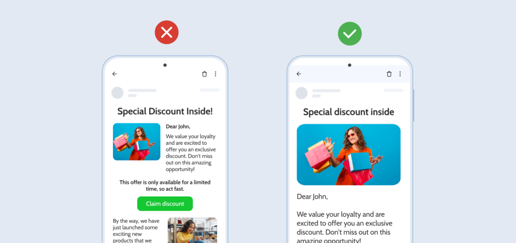
How we achieve this? With Stronde for Email you don’t have to worry how your email looks on mobile devices. Whether you use a single-column layout or double, we automatically adjust mobile to use a single-layout, making your content readable to mobile users.
One of the most crucial things about responsive emails, is having all the important information above the fold, to make sure that your recipient will see it. To achieve this, consider disabling some elements, such as images, for the mobile version of your email. On top of that, sometimes, images or animations can slow down your load times and ruin your email on mobile devices.
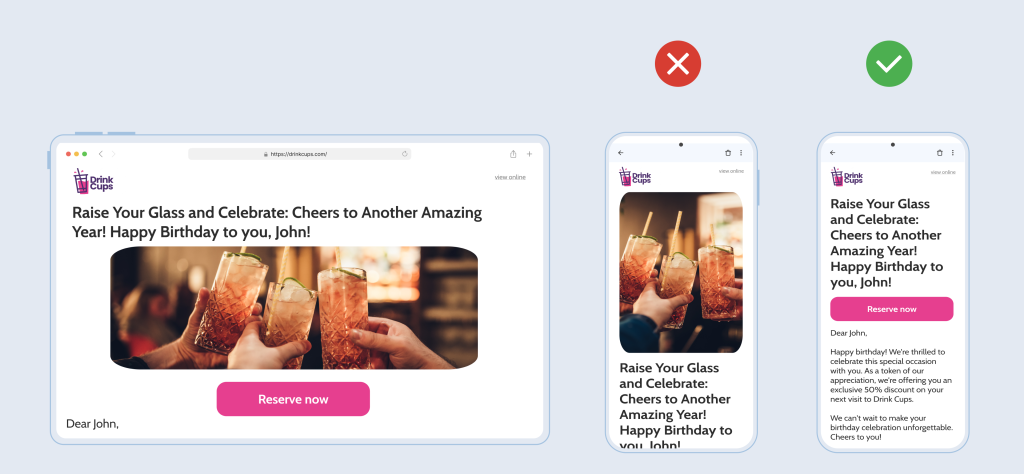
How we achieve this? With Stronde for Email you can easily choose which images to disable on mobile devices. Our pre-designed templates, already have unnecessary images disabled on mobile devices, helping you craft emails that even your mobile users love and engage.
Craft a compelling CTA using just a few impactful words to capture the reader's attention and drive action. Whether it's 'Shop Now,' 'Learn More,' or 'Get Started,' concise CTAs ensure that your message is clear and enticing on mobile screens.
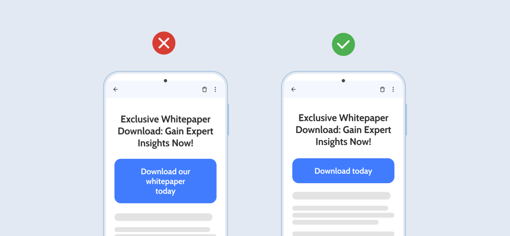
How we achieve this? With Stronde for email we inform you on the ideal character count on your CTAs, ensuring you don’t exceed the maximum that will impact the way your mobile users will see your CTAs.
Nothing looks worse than an image that's too big or too small on a screen, or an image that doesn’t make sense to the user. Make sure to resize your images based on the device to make your email look professional and polished.
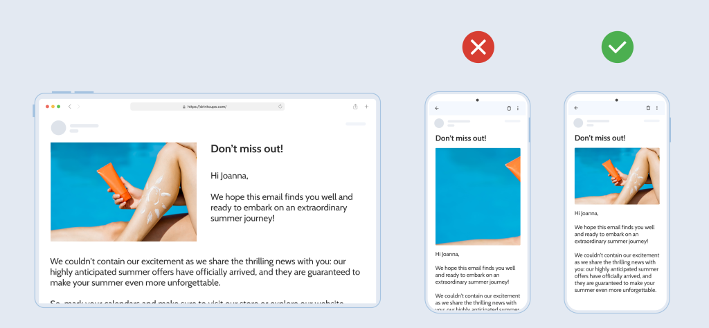
How we achieve this? With Stronde for email, you don’t have to worry about resizing images as not only do we automatically adapt images to fit different screen sizes and devices but creating images from our platform ensures they are email optimized – never too big, or too small to impact email engagement.
Before you activate an email campaign, make sure you preview and test your email on different devices. This will save you from any embarrassing formatting issues and ensure that your email looks great on every screen.
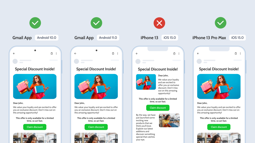
How we achieve this? With Stronde for email, not only you can preview your emails both on desktop and mobile devices, but you can rest-assure that they will render flawlessly across the 10 most popular email clients. We test every single email block frequently and adapt the blocks to cater for any recent updates from email clients – so that you can focus on what matters the most: crafting your email strategy.
In today’s fast-paced digital world, ensure your emails are accessible, readable, and engaging on any device. Enhance your mobile-first email design with Stronde for email. Start optimizing today and see improved engagement rates!
Do you use these 5 tips for optimizing emails for mobile devices? Any questions, ideas & tips – let us know in the comments!
Receive our weekly email marketing tips, strategies and latest trends, directly in your inbox!

Discover how Stronde for Email transforms Christmas campaigns effortlessly with speed, collaboration, compliance, and cost-effectiveness. Experience the magic firsthand.

Discover how Stronde for Email empowers agencies to become email marketing champions for their multiple clients.

Get into the Halloween spirit with 5 dark mode email tips that boost visibility and engagement.