
Discover how Stronde for Email transforms Christmas campaigns effortlessly with speed, collaboration, compliance, and cost-effectiveness. Experience the magic firsthand.
Want to see Stronde for email in action? Drop us your details and one of our team members will be in touch soon.
By submitting this form, you agree that we may use this information in accordance with our Privacy Policy.

Your question has been received, and we'll be in touch shortly.
With Halloween just around the corner, are your emails ready to haunt dark mode without a hitch? Dark mode is no longer a passing trend—it’s becoming the norm across devices, and for email marketers, that means your designs need to look their best in both light and dark modes. A spooky season demands visually captivating, eerily good emails that adapt to every user’s mode of choice.
Here are 5 hauntingly helpful tips to make sure your Halloween campaigns pop in dark mode and capture attention, not vanish into the shadows.
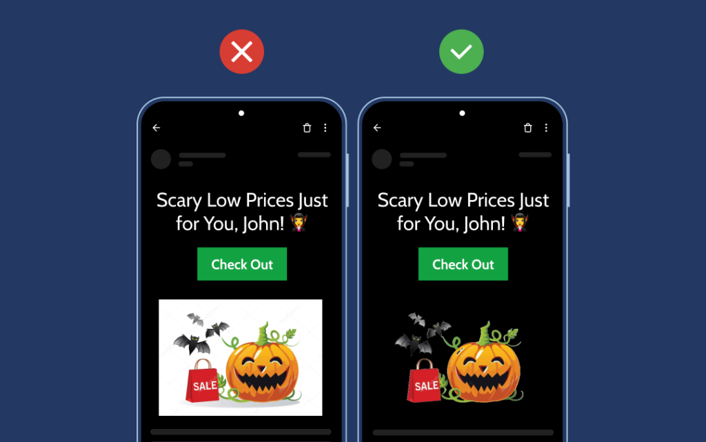
For that polished Halloween look, use transparent images that blend smoothly with any background—just like a ghost drifting through walls. Transparent images prevent unwanted color clashes, making your eerie visuals clear and captivating, no matter the background.
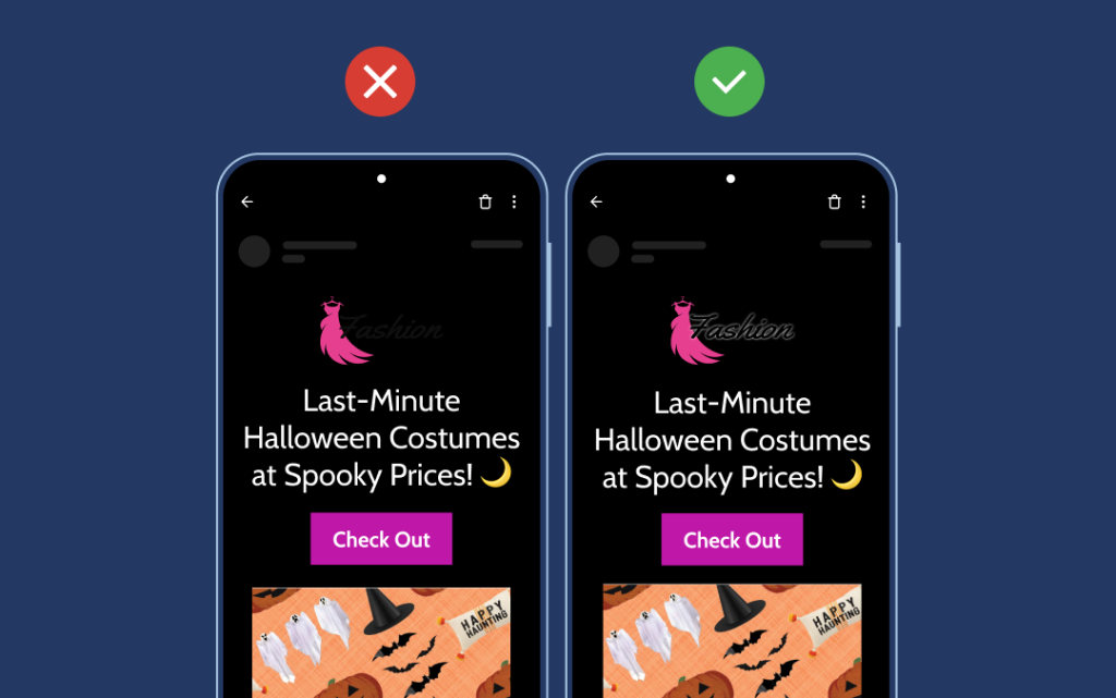
Don’t let your logo vanish into the Halloween night! Dark mode can be tricky for logos, especially if they feature dark colors. Adding a shadow effect keeps your logo visible against dark backgrounds, ensuring your brand identity remains intact—no tricks, just treats.
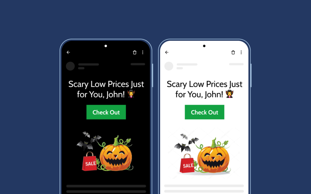
For a spellbinding look in dark mode, use high-contrast colors that work for both light and dark settings. This makes text and graphics pop, just like a jack-o’-lantern on a dark night. Apply this principle to hyperlinks, too, so they’re unmistakably clickable.
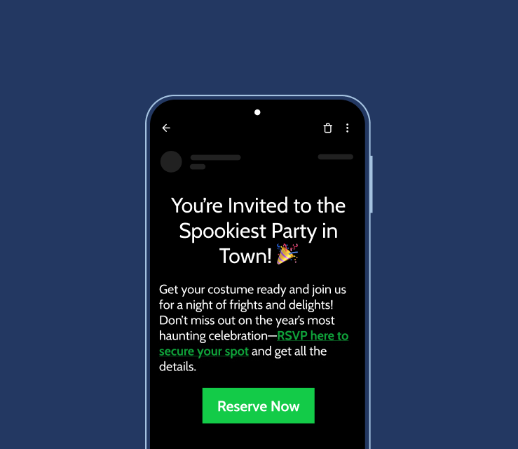
In the spooky spirit, make sure hyperlinks are visible and clickable in both modes. High-contrast link colors ensure no message gets lost in the shadows, letting readers explore your Halloween deals, events, or treats easily, no matter the mode.
Testing is your secret potion! Preview how your Halloween emails appear in dark mode to make sure everything looks just right. Establish dark mode guidelines, ensuring all elements play well across modes—no surprises, just smooth viewing and an enchanting experience.
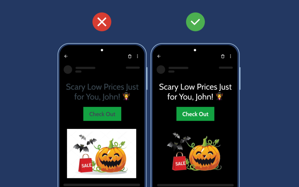
With these 5 tips—using transparent images, ensuring logo visibility, choosing high-contrast colors, enhancing hyperlinks, and diligent testing—you’re ready to create Halloween emails that haunt in the best way. Stronde for Email makes it easy to design emails that look spellbinding in both dark and light modes. Plus, our pre-built blocks are rigorously tested across the 10 most popular devices, ensuring seamless compatibility!
Request a Demo of Stronde for Email and create dark-mode-ready campaigns that are sure to captivate and convert! 🎃
Receive our weekly email marketing tips, strategies and latest trends, directly in your inbox!

Discover how Stronde for Email transforms Christmas campaigns effortlessly with speed, collaboration, compliance, and cost-effectiveness. Experience the magic firsthand.

Discover how Stronde for Email empowers agencies to become email marketing champions for their multiple clients.
Get into the Halloween spirit with 5 dark mode email tips that boost visibility and engagement.